

DESIGN SYSTEM
CASE STUDY
Designing for the 80%, Not the Enthusiast

TEAM
Cross-functional research team
(Founder &
4 researchers)
MY ROLE
UX Researcher
TIMELINE
3 Weeks
METHODS
Qualitative Synthesis
AI-assisted clustering
Insight Framing
DELIVERABLES
Affinity Mapping
Empathy & Personas
Presentation
LOOP is a design project shaped by tight constraints, competing priorities, and limited creative latitude.
It demonstrates my ability to deliver clear, effective outcomes in environments where success depends on adaptability, and designing beyond preference.


LOOP Bike is a UK-based mobility platform built on a single premise: make city cycling accessible to the 80% of people who don't currently cycle.
Unlike much of the cycling industry which often leans on performance, lifestyle aspiration, and insider language, LOOP explicitly sought to remove financial, psychological, and cultural barriers. The company operates across consumer, employer, and government contexts, requiring a visual system that could feel trustworthy, neutral, and usable at scale.
When LOOP engaged our team, the founder had already assembled a rudimentary visual direction and logo. The goal was not a full rebrand, but to establish a cohesive visual design system that could support future growth while avoiding traditional bike-industry cues.
DEFINE
When Industry Standard Visual Language Becomes a Barrier
Designing for accessibility in this context wasn’t about simplifying screens, as much as it was about removing signals of who a product is for.
Traditional bike branding often communicates:
-
Expertise over approachability
-
Aspiration over utility
-
Lifestyle over service
For LOOP, these signals would actively work against adoption. The visual system needed to communicate:
-
Baseline access, not status
-
Clarity over cleverness
-
Ease for first-time or hesitant users
-
Neutral appeal across demographics and institutions
This required letting go of familiar “good design” tropes in favor of cognitive ease and cultural neutrality.

RESEARCH
Reframing the Problem as Cultural Access
As a US-based designer unfamiliar with UK urban visual norms, I used AI-assisted research as an orientation tool to quickly ground the work in the cultural context LOOP operates within.
This included:
-
Understanding everyday UK streetscapes and public-facing design norms
-
Identifying how accessibility is visually communicated outside of sport or lifestyle branding.
The research mapped the competitive landscape across the full spectrum of cycling and adjacent service brands. That landscape organized into three categories: performance-heritage platforms signaling expertise and insider status, hybrid platforms that were functional but still aspirational, and inclusive platforms demonstrating that broad access is the result of deliberate signaling rather than simplification.

This orientation helped reframe accessibility as a cultural and cognitive problem, not just a usability one.

IDEATE
Mapping the Market: Exclusive, Hybrid, and Inclusive
Through market analysis and visual language breakdowns, the cycling space clustered into three distinct categories:
-
Exclusive | performance and heritage-led
-
Hybrid | functional, but still aspirational
-
Inclusive | neutral, friendly and institution-adjacent
Inclusive platforms such as Dance.co and Zenride.co demonstrated how accessibility could feel contemporary rather than stripped down by using simple geometry, bold but approachable color, and clear hierarchy. These anchored both where LOOP needed to land, and what to avoid.
The strategic territory itself came from the founder, yet had to be drawn out. From there, the design challenge was translating that intent into principles that could actually govern decisions consistently across a complex multi-audience system.
DESIGN
Design Principles for Cognitive Ease
Three principles guided the system:
Visual restraint with intention
Simplicity as a deliberate design tool, not as a lack of taste.
Singular Idea Screens
Reducing cognitive load by isolating actions and information.
Versatile Friendliness
Language and hierarchy designed to build trust across age, income and digital fluency levels.
The most consequential decisions: limiting density, stripping lifestyle imagery, choosing legibility over style - look obvious only in hindsight.
Visual restraint with intention
Simplicity as a deliberate design tool, not as a lack of taste.
Singular Idea Screens
Reducing cognitive load by isolating actions and information.
Versatile Friendliness
Language and hierarchy designed to build trust across age, income and digital fluency levels.

Accessibility was treated as a cognitive and emotional hurdle, not just visual.
Language, structure, and sequencing were designed to guide first-time users without assuming prior knowledge.

Legibility and hierarchy take priority over expressiveness.
Type and color choices were intentionally chosen outside of industry language to avoid signaling expertise or exclusivity.

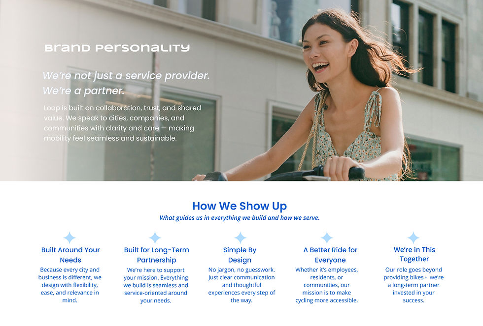
Building a Visual Design System Under Constraint
Midway through the project, early visual directions were intentionally set aside, compressing the timeline and requiring rapid recalibration. Rather than converging prematurely, the focus shifted to establishing a clear, usable system that aligned with LOOP’s access-first mission.
The result was a structured visual design system that needed to flex across consumer, employer, and public-sector contexts while remaining culturally neutral.
Designed as a service-first visual system, not a lifestyle brand.
V3 establishes clear lines around tone, hierarchy, and restraint to support trust and ease across consumer, employer, and government contexts.
Presenting Bounded Options, Not Endless Iterations
To support decision-making without fragmenting the system, I presented two parallel design directions, built on the same underlying structure:
Access-First Baseline (V3)
A neutral, service-oriented system optimized for clarity, trust, and cross-sector use.
Contemporary / Gen Z Variant (V4)
A stylistic alternative exploring brighter color blocking, playful geometry, and increased cultural warmth, without reintroducing exclusionary cues.
These were offered side by side, not sequentially, defining a bounded decision space rather than an open-ended iteration loop.
DELIVER
From System to Application: Landing Page Concept
The system was synthesized into a landing page concept that prioritized:
-
Clear hierarchy
-
Minimal cognitive load
-
Straightforward entry into an unfamiliar service
This translation from system to application ensured the work could move forward practically, not just conceptually.

Landing Page Concept:
Built to move the project forward under time constraints.
The page demonstrates how the system performs in practice, as alignment was prioritized over polish.


REFLECT
What Delivery Looks Like When Time Is Limited
Under a compressed timeline, the work shifted from optimizing for polish to prioritizing alignment and forward momentum.
The initial system established structural clarity; later iterations clarified how accessibility lives not just in language, but in the cumulative effect of tone, imagery, hierarchy, and restraint. While the final output was not a fully resolved endpoint, it successfully defined the right direction - and just as importantly, the boundaries of what would not serve the audience.
With more time, I would have expanded validation across additional institutional contexts and further refined the balance between neutrality and cultural warmth.
This project reinforced a core principle in my practice:
When designing for access, success is measured less by sophistication and more by who feels invited in.

Unlike research-heavy projects where AI plays a central synthesis role, AI here functioned as a contextual accelerator.
I used AI to:
-
Rapidly orient myself to UK cultural and visual norms
-
Reduce blind spots stemming from geographic distance
-
Free up time for higher-order judgment and system design
All critical decisions: categorization, prioritization, and system direction - remained human-led. AI was a scaffold. Judgement is where the work remained.
This mirrors how I use AI in practice: to expand context, rather than outsource thinking.